


CV
Email me
Biolink Health app
Rethinking what a diabetes app should feel like
Biolink Health is a mobile app for people with type 2 diabetes — glucose logging, food and activity tracking, educational content, and expert consultations, all aimed at building habits that stick.
Problem
People with type 2 diabetes manage glucose, meals, activity, and medication — every single day. Most tools make it unnecessarily hard.
Biolink.Tech was a startup building a wearable for continuous glucose monitoring. The goal was to make all that tracking easy to act on.
Solution
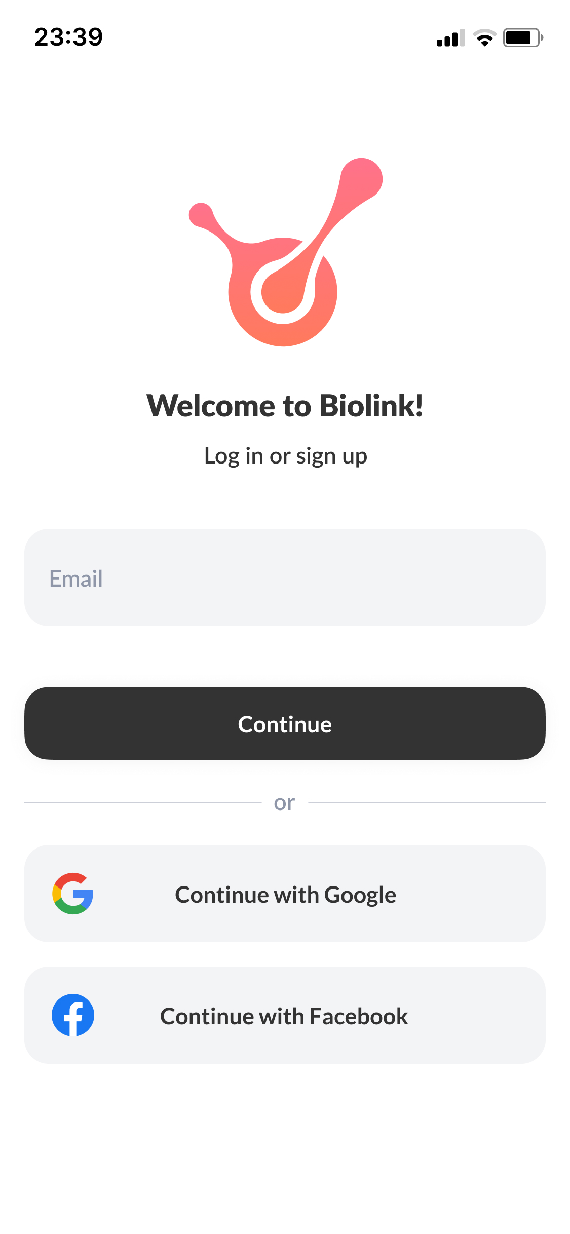
As the sole designer, I built a companion app to connect the wearable to the user — simple enough for daily use, and fully functional even without the device.
I started from zero: no design system, no existing components. I ran user interviews first, then shaped the product structure and a reusable component library as I went.
The navigation was built to show how food, activity, and glucose affect each other over time. Logging anything takes as few taps as possible.
What MVP testing showed
82
System Usability Score
3–4
taps to log a full entry, vs 6–8 in competing trackers
93%
success rate — 14 of 15 users completed key flows unaided
Interface overview
Summary
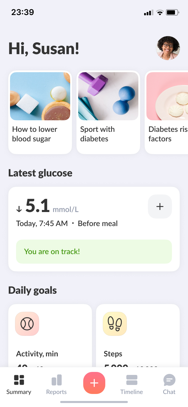
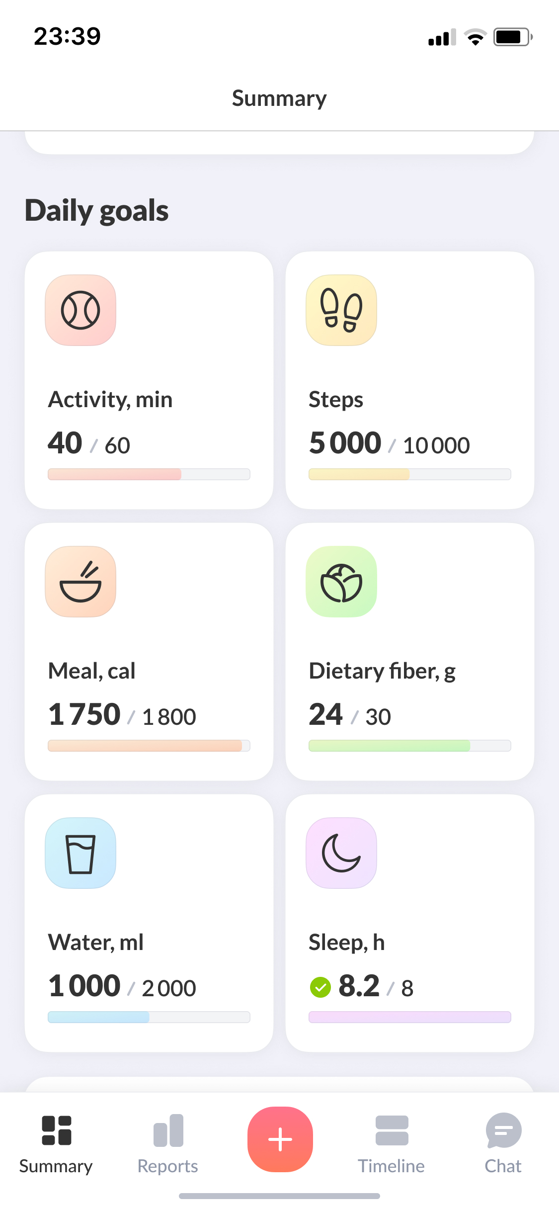
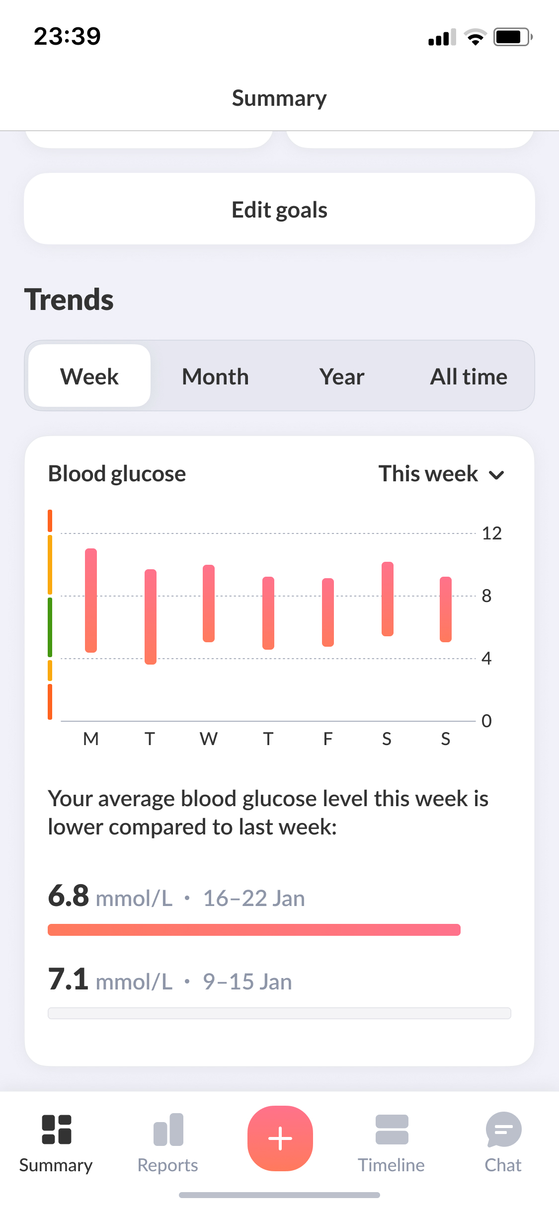
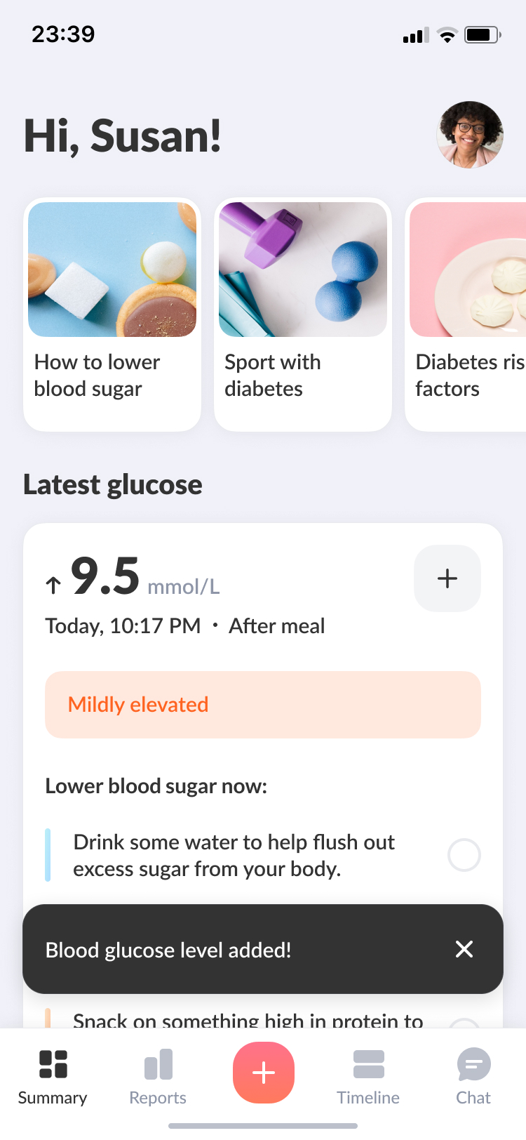
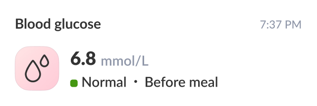
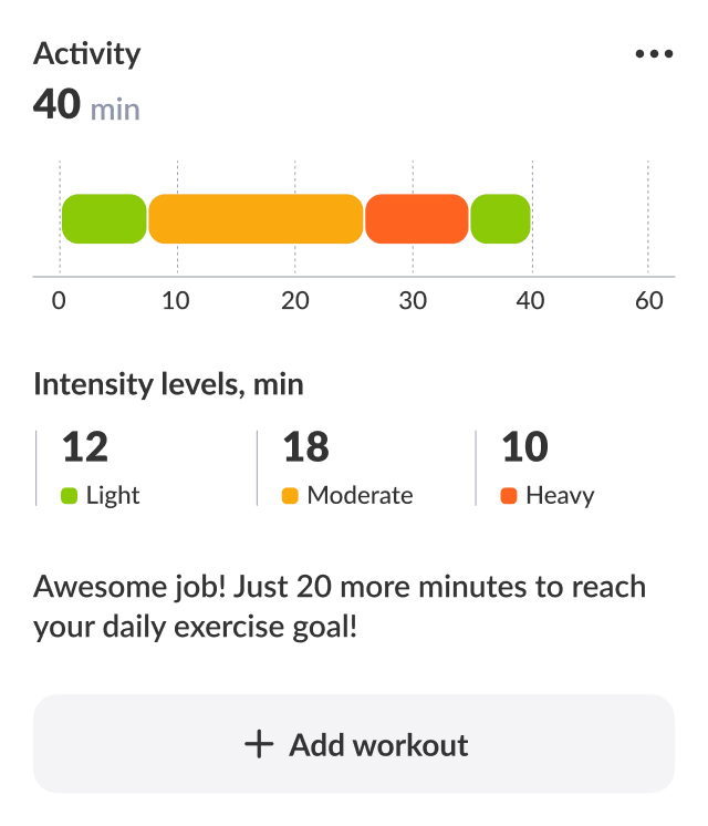
The first screen after login shows the latest glucose reading and educational content in a Stories format. Below that, daily goals give users a quick sense of where they stand — activity, meals, steps. The trend card adds context, showing where their health is heading over the past week, month, or year.
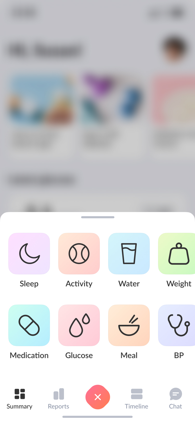
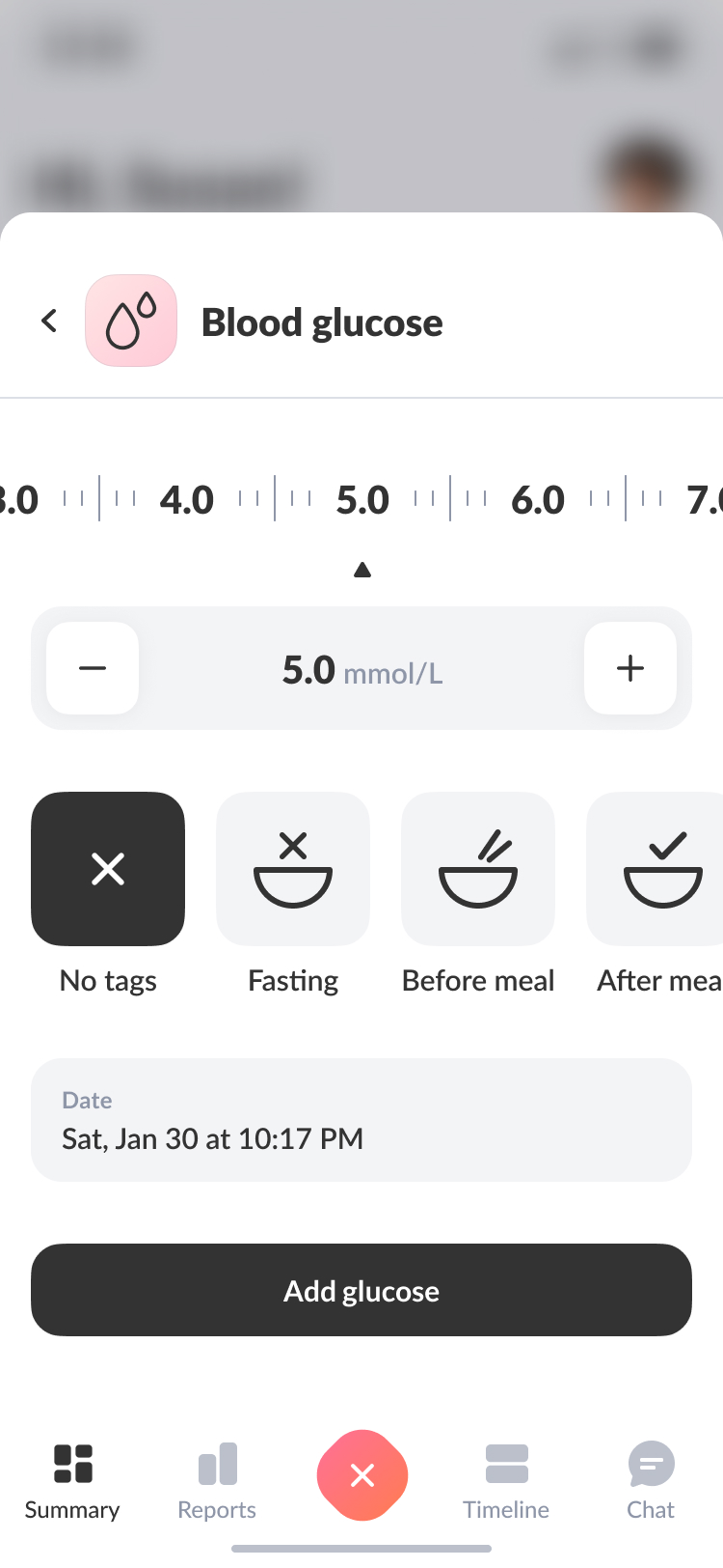
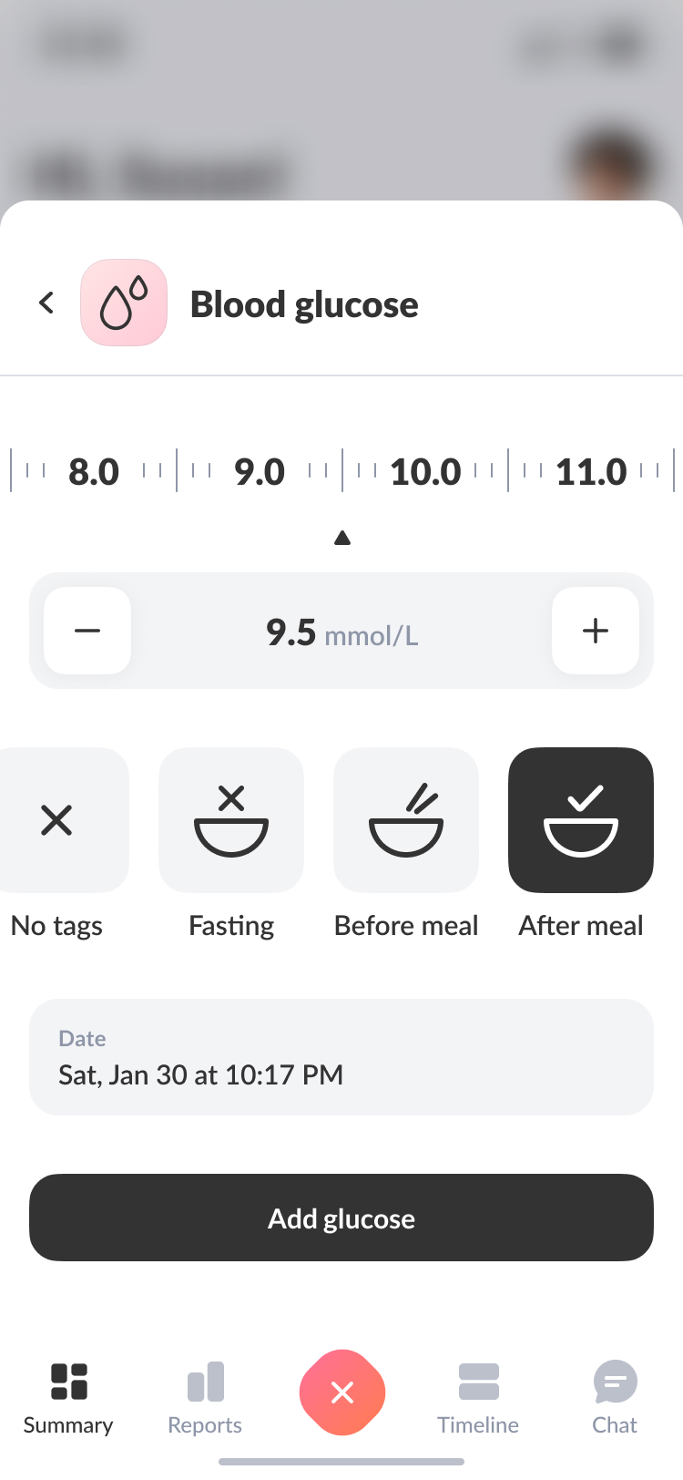
Actions & to-dos
Diabetes means logging a lot, every day. I designed a bottom navigation hub to make that as quick as possible — any entry in 3–4 taps. When readings are abnormal, the app surfaces personalised to-dos: small, actionable steps tailored to the user's data to help them get back on track.
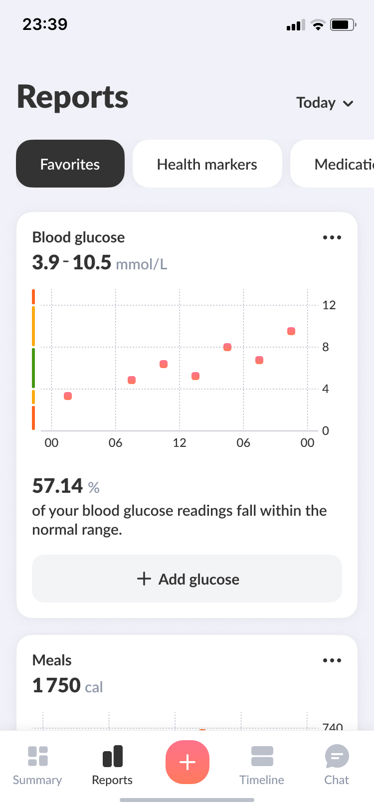
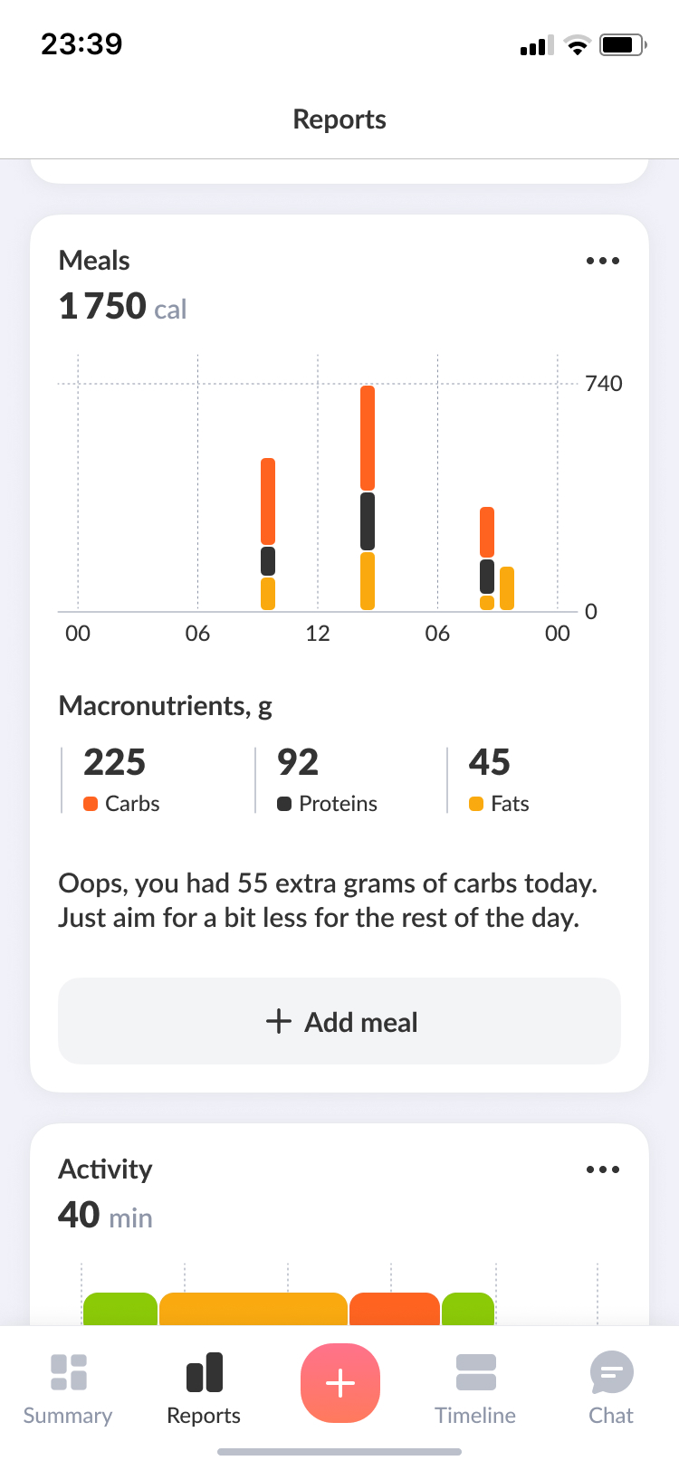
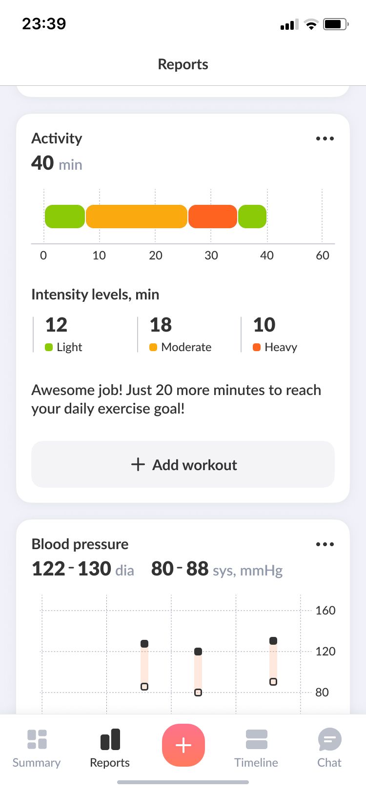
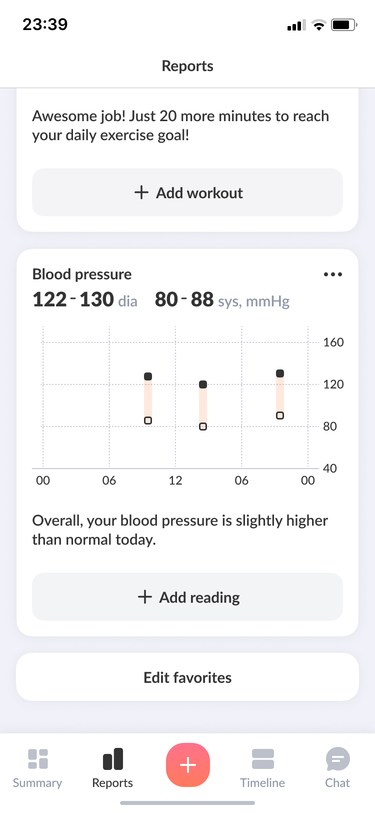
Reports
Glucose, meals, and activity are all on one page — so users can see how their habits affect their sugar levels, spot patterns, and get ahead of spikes before they happen.
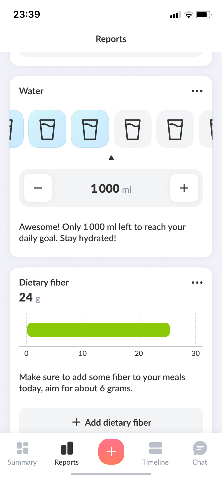
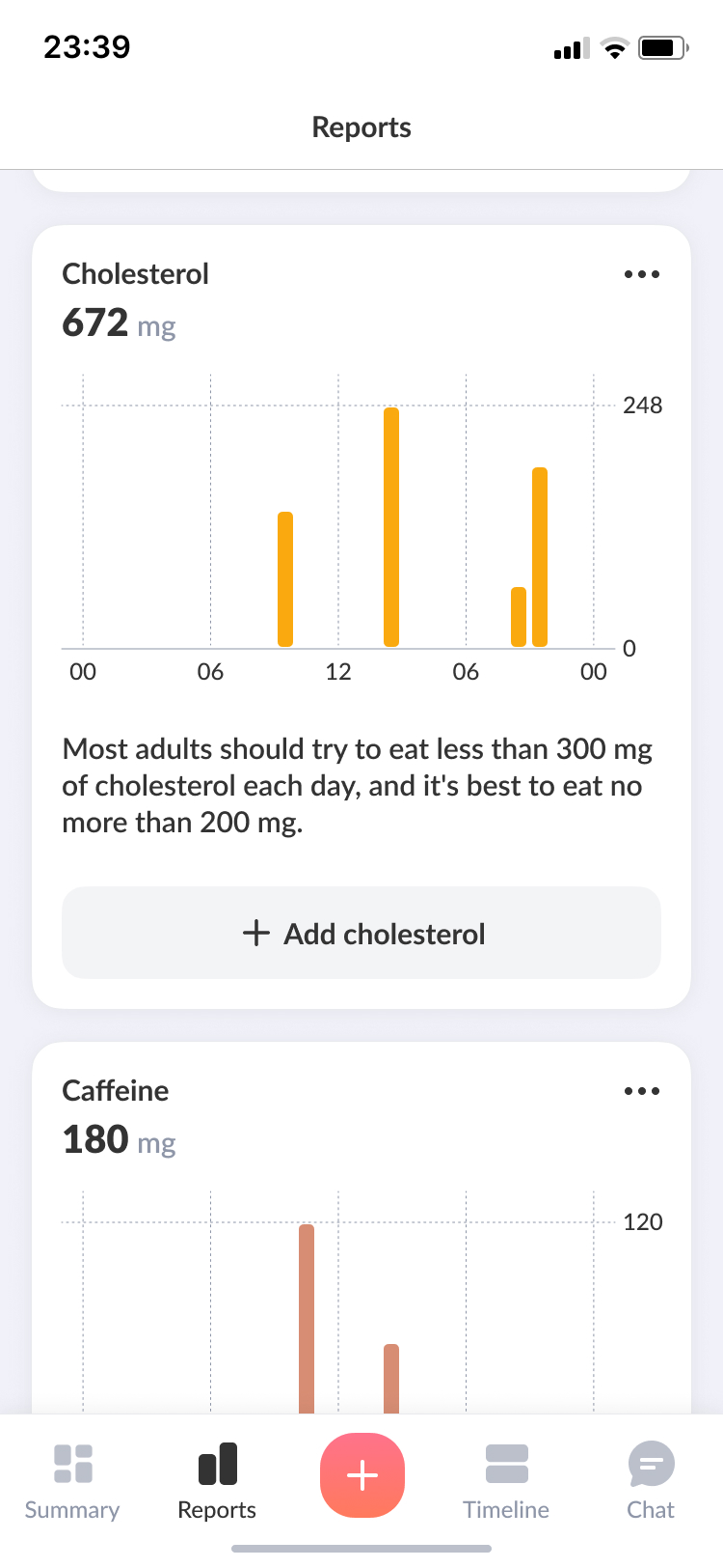
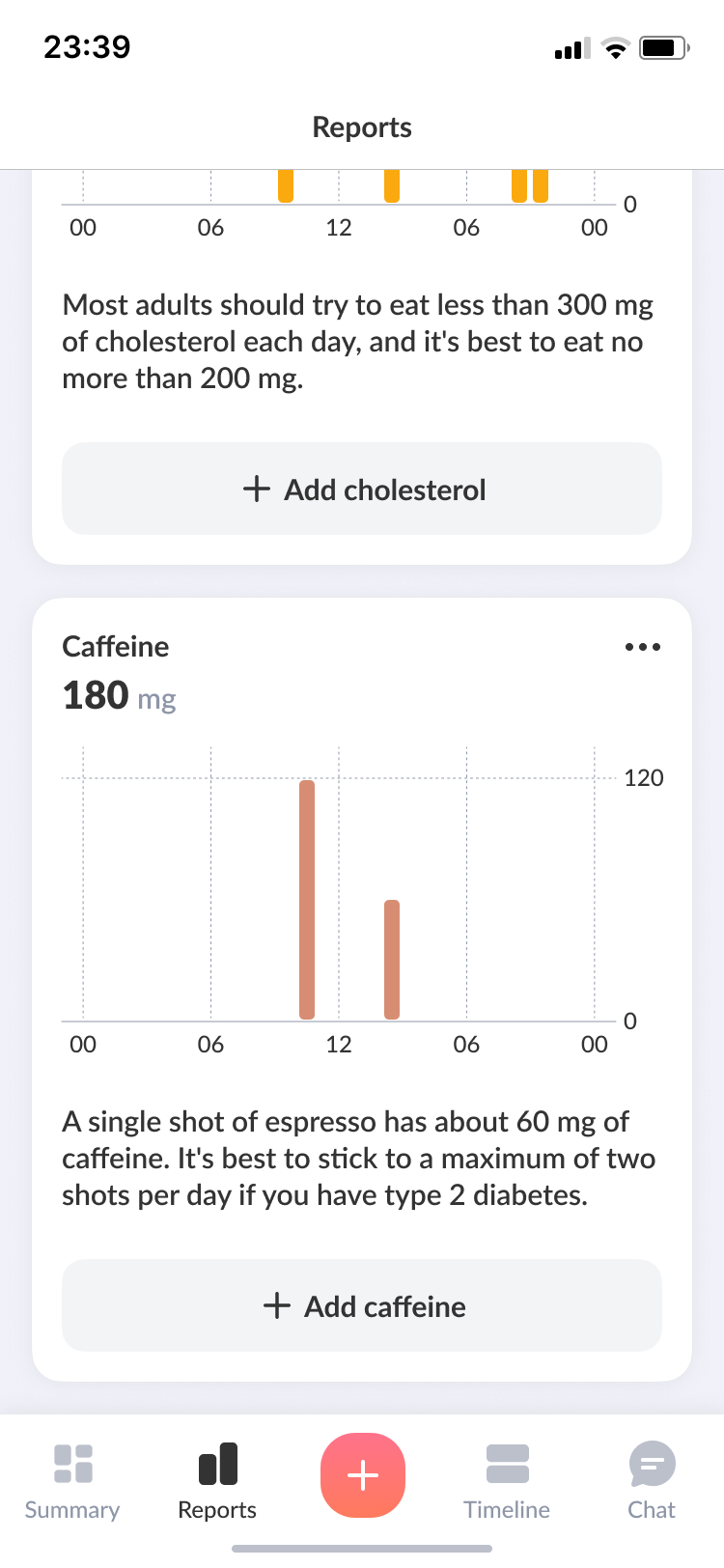
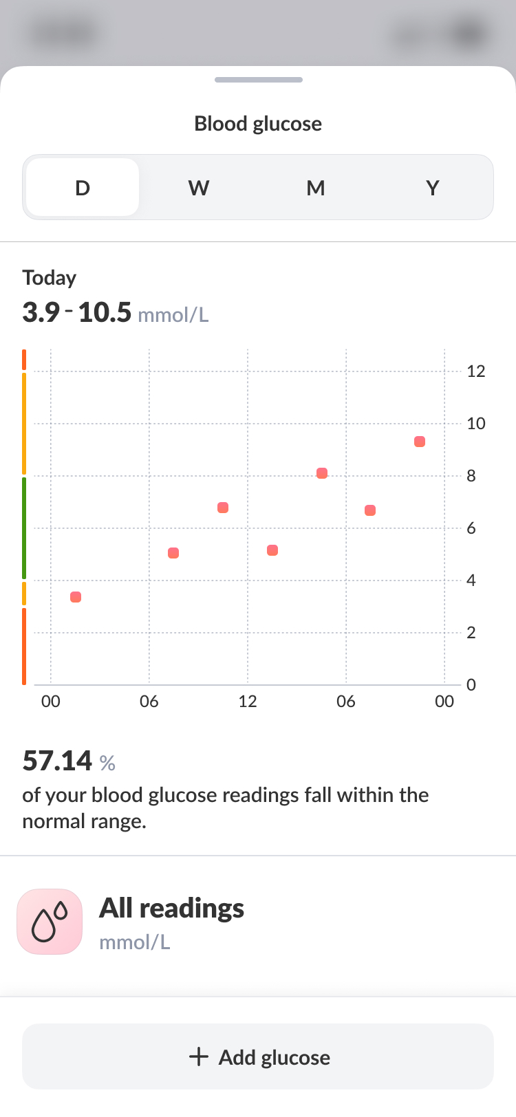
Report details
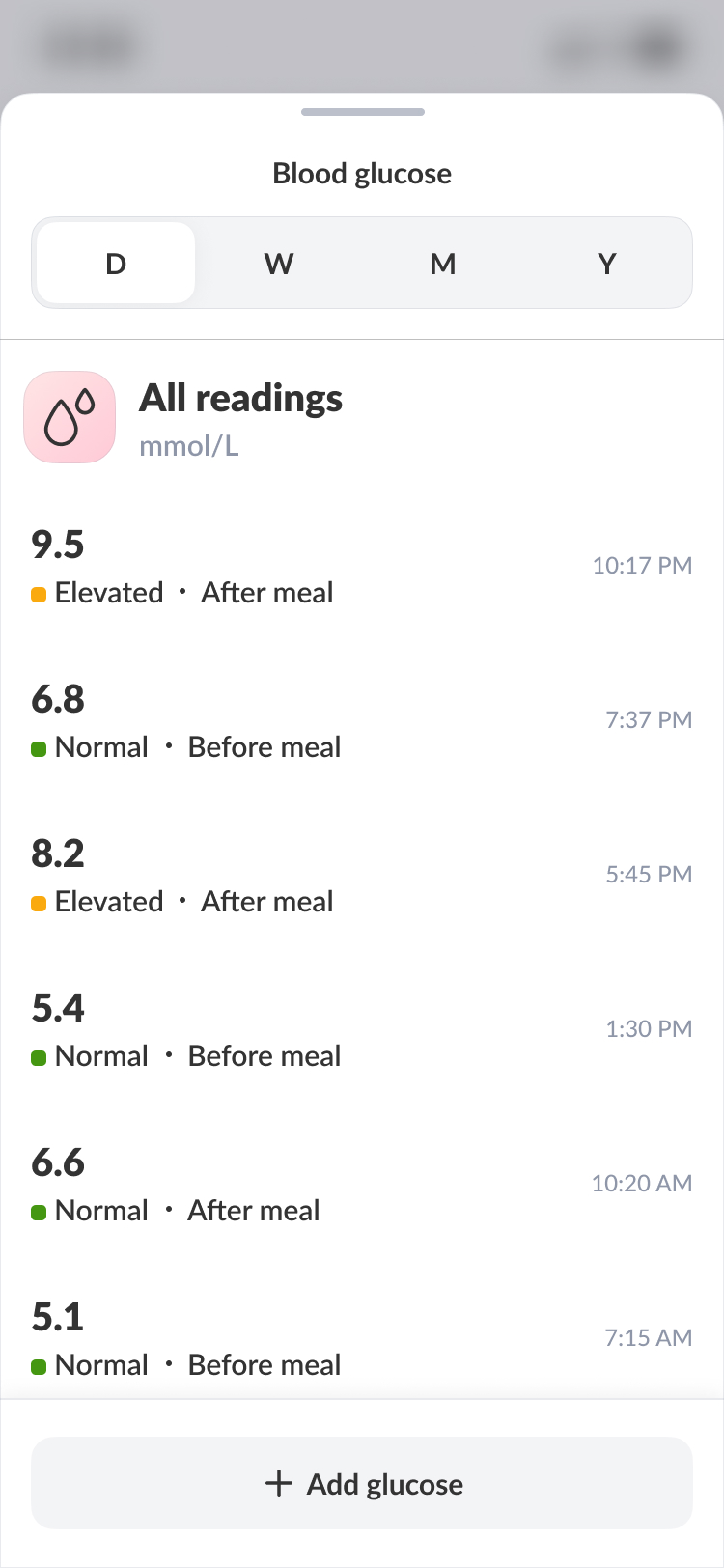
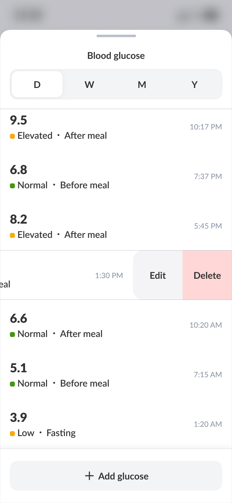
Tapping on a report card reveals the detailed log history for that specific report. This allows focusing on a particular metric and easily sharing relevant data with a physician.
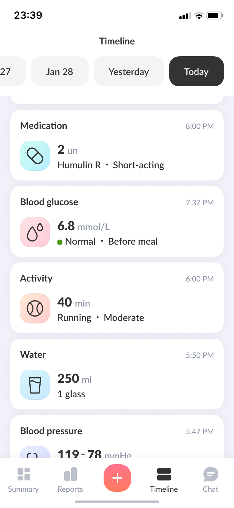
Timeline
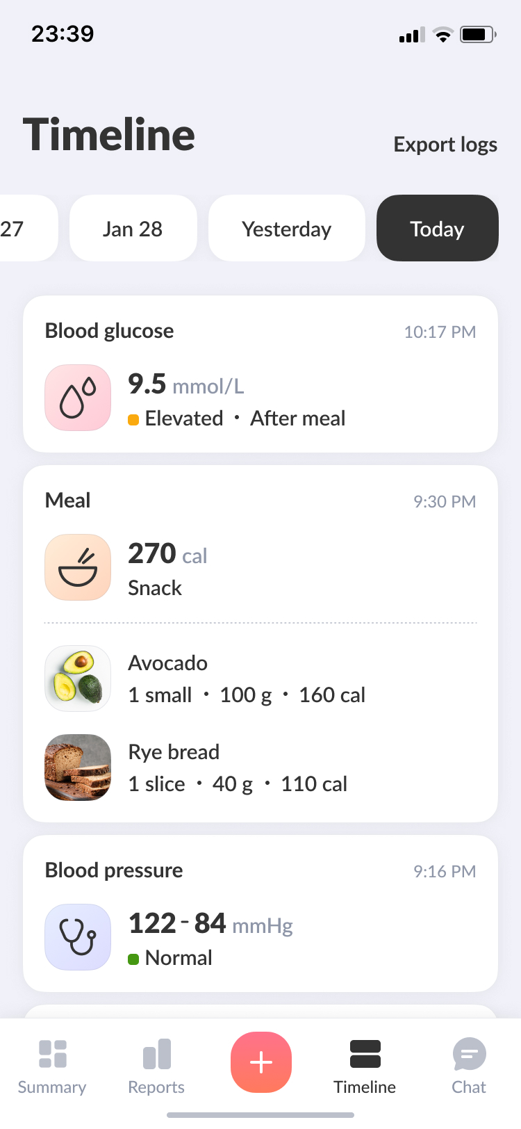
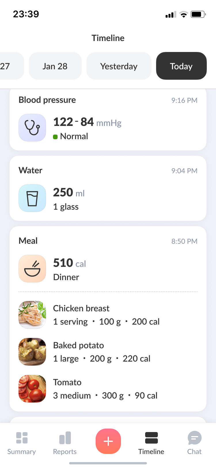
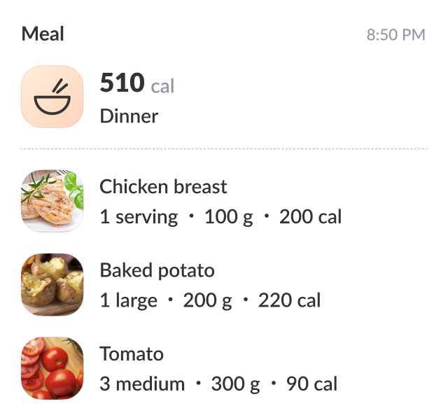
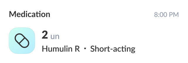
A chronological view of glucose, meals, medication, and activity in one place — so users can see exactly how their daily choices shape their health over time.
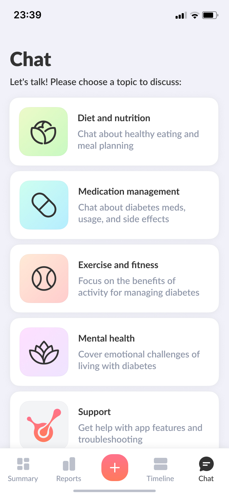
Chat
The chat offers personalised guidance for newly diagnosed users — helping them respond to health changes and take timely action. It also doubles as a support channel for any questions or issues along the way.
Takeaways
Difficulties
No design system, no prior research, no other designers — I built everything from scratch while shipping. The domain required real investment: designing for people with diabetes means understanding their condition, not just their workflows.
Key lessons
- User research is non-negotiable, even under time pressure.
- Bring engineers in early — it saves everyone time.
- The best outcome comes from listening to everyone involved, not just executing on your own ideas.


Biolink Health is a mobile app for people with type 2 diabetes — glucose logging, food and activity tracking, educational content, and expert consultations, all aimed at building habits that stick.
Alex Dontsov
CV
Email me
Biolink Health app
Rethinking what a diabetes app should feel like
Problem
People with type 2 diabetes manage glucose, meals, activity, and medication — every single day. Most tools make it unnecessarily hard.
Biolink.Tech was a startup building a wearable for continuous glucose monitoring. The goal was to make all that tracking easy to act on.
Solution
As the sole designer, I built a companion app to connect the wearable to the user — simple enough for daily use, and fully functional even without the device.
I started from zero: no design system, no existing components. I ran user interviews first, then shaped the product structure and a reusable component library as I went.
The navigation was built to show how food, activity, and glucose affect each other over time. Logging anything takes as few taps as possible.
What MVP testing showed
82
System Usability Score

3–4
taps to log a full entry, vs 6–8 in competing trackers
93%
success rate — 14 of 15 users completed key flows unaided
Interface overview
Summary
The first screen after login shows the latest glucose reading and educational content in a Stories format. Below that, daily goals give users a quick sense of where they stand — activity, meals, steps. The trend card adds context, showing where their health is heading over the past week, month, or year.
Actions & to-dos
Diabetes means logging a lot, every day. I designed a bottom navigation hub to make that as quick as possible — any entry in 3–4 taps. When readings are abnormal, the app surfaces personalised to-dos: small, actionable steps tailored to the user's data to help them get back on track.
Reports
Glucose, meals, and activity are all on one page — so users can see how their habits affect their sugar levels, spot patterns, and get ahead of spikes before they happen.
Report details
Tapping on a report card reveals the detailed log history for that specific report. This allows focusing on a particular metric and easily sharing relevant data with a physician.
Timeline
A chronological view of glucose, meals, medication, and activity in one place — so users can see exactly how their daily choices shape their health over time.
Chat
The chat offers personalised guidance for newly diagnosed users — helping them respond to health changes and take timely action. It also doubles as a support channel for any questions or issues along the way.
Takeaways
Difficulties
No design system, no prior research, no other designers — I built everything from scratch while shipping. The domain required real investment: designing for people with diabetes means understanding their condition, not just their workflows.
Key lessons
- User research is non-negotiable, even under time pressure.
- Bring engineers in early — it saves everyone time.
- The best outcome comes from listening to everyone involved, not just executing on your own ideas.


Alex Dontsov
CV
Email me
Biolink Health app
Rethinking what a diabetes app should feel like
Biolink Health is a mobile app for people with type 2 diabetes — glucose logging, food and activity tracking, educational content, and expert consultations, all aimed at building habits that stick.
Problem
People with type 2 diabetes manage glucose, meals, activity, and medication — every single day. Most tools make it unnecessarily hard.
Biolink.Tech was a startup building a wearable for continuous glucose monitoring. The goal was to make all that tracking easy to act on.
Solution
As the sole designer, I built a companion app to connect the wearable to the user — simple enough for daily use, and fully functional even without the device.
I started from zero: no design system, no existing components. I ran user interviews first, then shaped the product structure and a reusable component library as I went.
The navigation was built to show how food, activity, and glucose affect each other over time. Logging anything takes as few taps as possible.
What MVP testing showed
82
System Usability Score
3–4
taps to log a full entry, vs 6–8 in competing trackers
93%
success rate — 14 of 15 users completed key flows unaided
Interface overview
Summary
The first screen after login shows the latest glucose reading and educational content in a Stories format. Below that, daily goals give users a quick sense of where they stand — activity, meals, steps. The trend card adds context, showing where their health is heading over the past week, month, or year.
Actions & to-dos
Diabetes means logging a lot, every day. I designed a bottom navigation hub to make that as quick as possible — any entry in 3–4 taps. When readings are abnormal, the app surfaces personalised to-dos: small, actionable steps tailored to the user's data to help them get back on track.
Reports
Glucose, meals, and activity are all on one page — so users can see how their habits affect their sugar levels, spot patterns, and get ahead of spikes before they happen.
Report details
Tapping on a report card reveals the detailed log history for that specific report. This allows focusing on a particular metric and easily sharing relevant data with a physician.
Timeline
A chronological view of glucose, meals, medication, and activity in one place — so users can see exactly how their daily choices shape their health over time.
Chat
The chat offers personalised guidance for newly diagnosed users — helping them respond to health changes and take timely action. It also doubles as a support channel for any questions or issues along the way.
Takeaways
Difficulties
No design system, no prior research, no other designers — I built everything from scratch while shipping. The domain required real investment: designing for people with diabetes means understanding their condition, not just their workflows.
Key lessons
- User research is non-negotiable, even under time pressure.
- Bring engineers in early — it saves everyone time.
- The best outcome comes from listening to everyone involved, not just executing on your own ideas.
